giffgaff · Senior Product Designer
Oct 2024 - Present
First product live on giffgaff’s new platform - and the research practice and AI analysis that showed what worked
As sole designer on giffgaff's phone purchase journey, I redesigned it as it moved to a new platform - and built the research practice, analytics and AI tools that showed what worked. Members who buy a phone stay eight months longer, but just 3.5% named us unprompted as somewhere to buy a phone.
Handset sales were up 10% year on year in H1 2026. Then phones became the first product live on the new platform, with 31% fewer clicks on the phone pages and sales held flat through the switch. Five months later the rebrand launched on the same journey, in time for Black Friday, with three of the six top-priority pages mine.
Along the way I built a research practice other teams adopted, championed a design system for a year before it was prioritised, and mentored a designer into running his own area.
+10%
H1 2026 handset sales, YoY
2
tracking failures caught by the AI tool I built
3
Claude skills I built
31%
fewer clicks on phone pages
My role
Sole product designer on the Devices team, working with a Product Manager, a Content Designer, front and backend engineers and Business Insights - and mentoring a Product Designer working across Phones and Payments.
I led:
Product design - the Range Page, the Refurbished and Pay Monthly phone pages and the plan selector
AI tooling - three Claude skills, for analysis, research synthesis and design review
Research - five research days, including giffgaff's first accessibility day, co-created with an engineer on the team
Analytics - the migration's before-and-after measurement in Medallia
Journey mapping across the legacy and new stacks
Design system foundations - AI-assisted semantic tokens
High-fidelity prototyping, workshops and stakeholder presentations
AI in my practice
Research synthesis. A Claude plugin that turns session transcripts into a cited readout, with a second agent that checks the report against its sources before anyone sees it. By my estimate it cut synthesis time by around 70% - and the readouts got better, not just faster.
Behavioural analysis. A Claude skill holding 85,000 characters of rules for reading Medallia, published for every team at giffgaff. By my estimate it roughly halved my analysis time, and it caught two tracking failures before they were read as a drop in sales.
Design review. A skill that checks designs against giffgaff's brand and accessibility standards.
Verification. An AI browser agent re-pulled and cross-checked every figure in my report against the live system in a day.
The common thread: AI does the pulling, I decide what to trust, and that judgement is built into the tools so the next person inherits it.
What I walked into: a rebuild that needed more evidence
giffgaff was moving its phone purchase journey off Portal, its legacy stack, onto a new microservices platform, and most of the journey still had to be designed. The case was commercial: a million members change phones every year, but 90% don't buy from giffgaff.
The team had evidence to start from but needed more: one research day had been run, but there was no repeatable practice, no analytics reporting and no map of the journey. I facilitated the observation room at giffgaff's second research day, two weeks in, and led the five research days that followed.
That second day told me where to start. Four of six participants wanted refurbished phones and four of six wanted to pay monthly; the new journey supported neither yet. Refurbished phones were generating a 22% contact rate for condition, payment and returns issues, and 48% of phone sales were pay monthly - on a new stack that didn't offer it yet.
Shown at the same scale. The MFE journey was mapped as two scenarios: members with and without a plan.
Five research days that shaped every page
Five research days over two years, each followed by a workshop. Other teams adopted the format.
February 2025 - the live journey. Six participants tested the refurbished journey on Portal; four of six didn't know the finance was interest-free, and most of the product page changes below came out of this day.
August 2025 - giffgaff's first accessibility research day, co-created with Abi, one of our engineers. Four of five disabled participants hit an obstacle, and four of five still completed the purchase - most of the findings would have caught anyone.
2026 - two remote moderated days. Ten participants rated the new journey 4.8 out of 5 for ease, but plans above specs created a "visual wall", and five of the six asked said a pre-selected plan wasn't acceptable.
"I felt like I was being led down a path... like you're trying to lead me to buy something I might not want."
I also used these days, alongside commissioned quantitative research (N=800), to argue against a proposed cross-team change to the journey. The business changed direction before it shipped.
Readouts rebuilt in Claude. I rebuilt our AI-generated research readouts in Claude for the fifth day, in September, citing every finding to its transcript timestamp; that day tested a journey that isn't public yet, so its findings stay inside giffgaff. The workflow is now a plugin published to the Experience and Product teams.
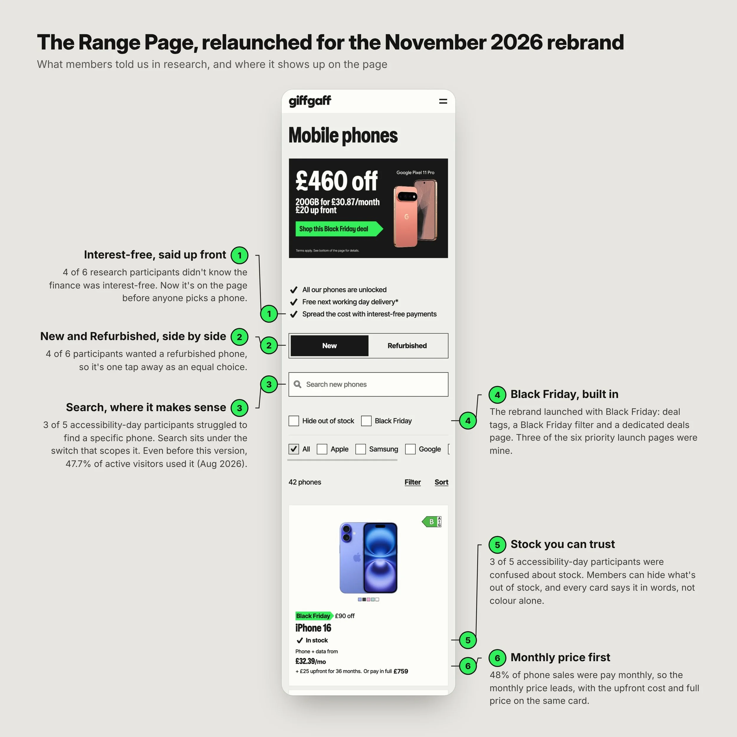
The Range Page in four days
March 2025. Without a Range Page on the new stack, 60% of app-initiated purchases were falling back to Portal. The team was worried about time.
Our lead engineer said the build would be fast if he knew what it should look like. I proposed he start building a skeletal frame from the existing layout while I designed key elements and fed them in as I went. Design and build ran simultaneously. Fully functioning, fully accessible, in production in four working days.
Our Mobile Product Director confirmed on stage that building it accessible from day one took no extra time. Retrofitting would have doubled it.
What I designed: refurbished, pay monthly and a simpler way to pick a plan
The New Phones PDP predated me - Francesc and Jonas designed it, and it was in testing when I arrived. I led the Refurbished and Pay Monthly product pages, which built on that design but carried far more functionality to migrate from Portal, fixing problems as we went - plus the Range Page and the plan selector. The app phones page also predated me; my changes to it and to the New Phones PDP were minor.
The Refurbished PDP. Members understood the four condition grades but couldn't see how condition affected warranty or price. I moved the warranty into the selected condition, alongside its description and price, so changing a condition shows its effect immediately. The 80% battery-health promise, which research showed read as low confidence for "Like New" phones, moved out of the decision and down beside checkout with the other reassurances. Below the purchase, I replaced a stack of collapsed accordions with open sections for key specs, features, and returns and warranty.
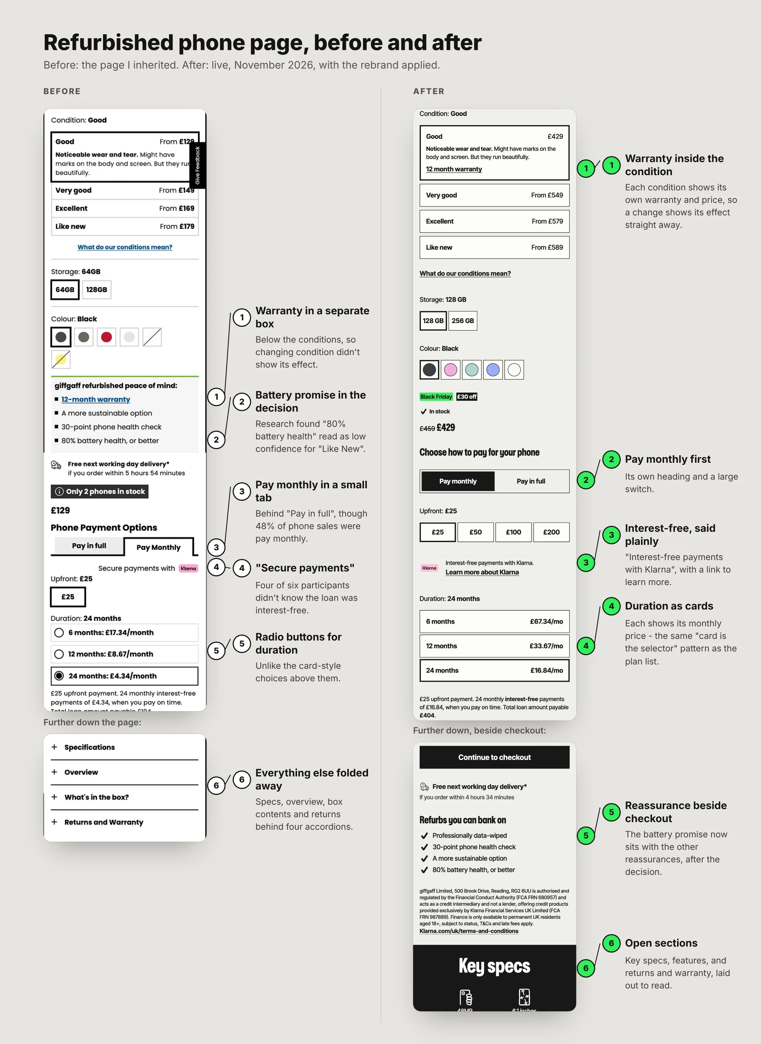
The Pay Monthly PDP. 48% of phone sales were pay monthly, but the option sat in a small tab behind "Pay in full". I gave the choice its own heading - "Choose how to pay for your phone" - with a large switch and pay monthly first, and turned the duration options into selectable cards showing the monthly price for each. Four of six research participants didn't know the loan was interest-free, so "Secure payments with Klarna" became "Interest-free payments with Klarna", and "what's in the box" moved to after payment, where it sets expectations without blocking the purchase.
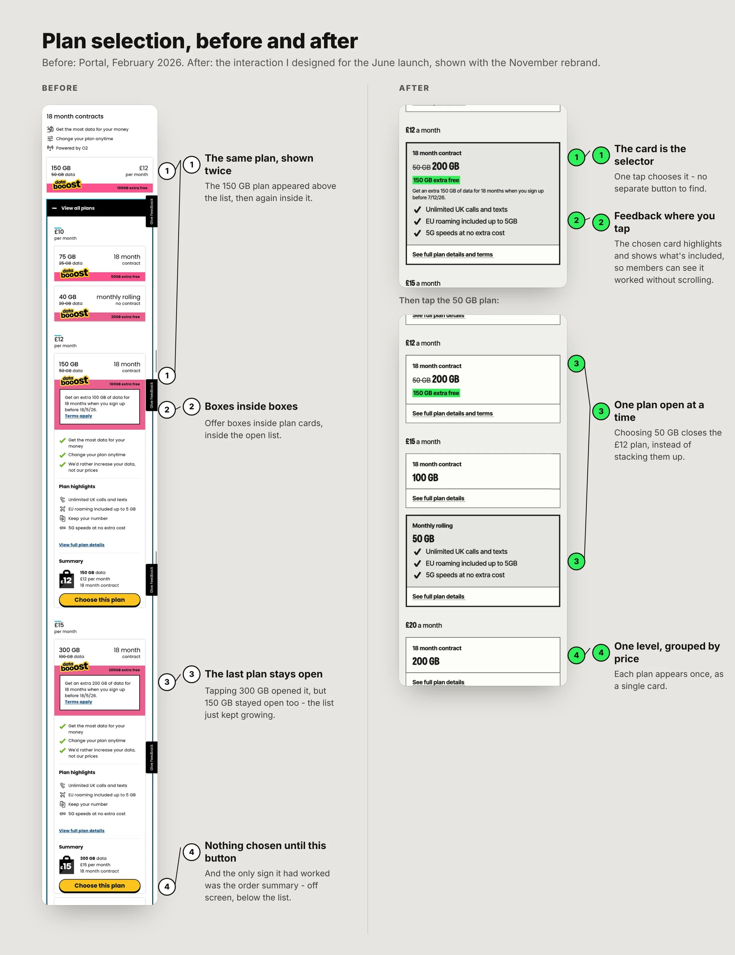
Plan selection. On Portal, the same plan appeared twice - above the list and inside it. Opening the list put boxes inside boxes, tapping another plan opened it without closing the first, and nothing was actually selected until members found a separate "Choose this plan" button. Even then, the only sign it had worked was the order summary, off screen below the list. I made the card the selector: one level of cards grouped by price, one tap to choose, and the chosen card highlights right where members tapped, matching how the condition and upfront-payment selectors already worked. One interaction removed - and the change behind 31% fewer clicks across the New and Refurbished phone pages.
How I measured it - with an AI tool I built
Reading Medallia, our behavioural analytics tool, took specialist knowledge, so I built that knowledge into a Claude skill and used it to compare 28 days either side of the migration, with per-pageview rates so traffic growth couldn't skew the result.
Members needed 31% fewer clicks per page view - two independent measurement methods agreed to within half a percentage point - and hesitated 28-40% less before scrolling. Checkout's share of clicks on the Refurbished page rose from 13% to 21%, and the share of clicks on "See all specs" rose 2.6 times on the Refurbished page.
The report states a confidence level for every finding and refuses to quote commercial figures from unreliable sources. It also caught what the dashboard was hiding: Medallia's Technical score read 9.9 before and after, while underneath, slow page loads had fallen by over 90% - the platform team's engineering win - and JavaScript errors had risen five to sevenfold. Engineering confirmed it.
The skill also caught two tracking failures the migration had introduced. A funnel step stopped matching when a live URL changed, so orders appeared to collapse; I dated the break to the day and showed against BI's order data that it was measurement, not trading. Separately, checkout was firing its conversion event on only about three-quarters of orders, and I verified engineering's fix. Both would have been read as a drop in sales. The Broadband team found the same weakness in their funnel and adopted the same fix.
Five months on: the same journey carried the rebrand
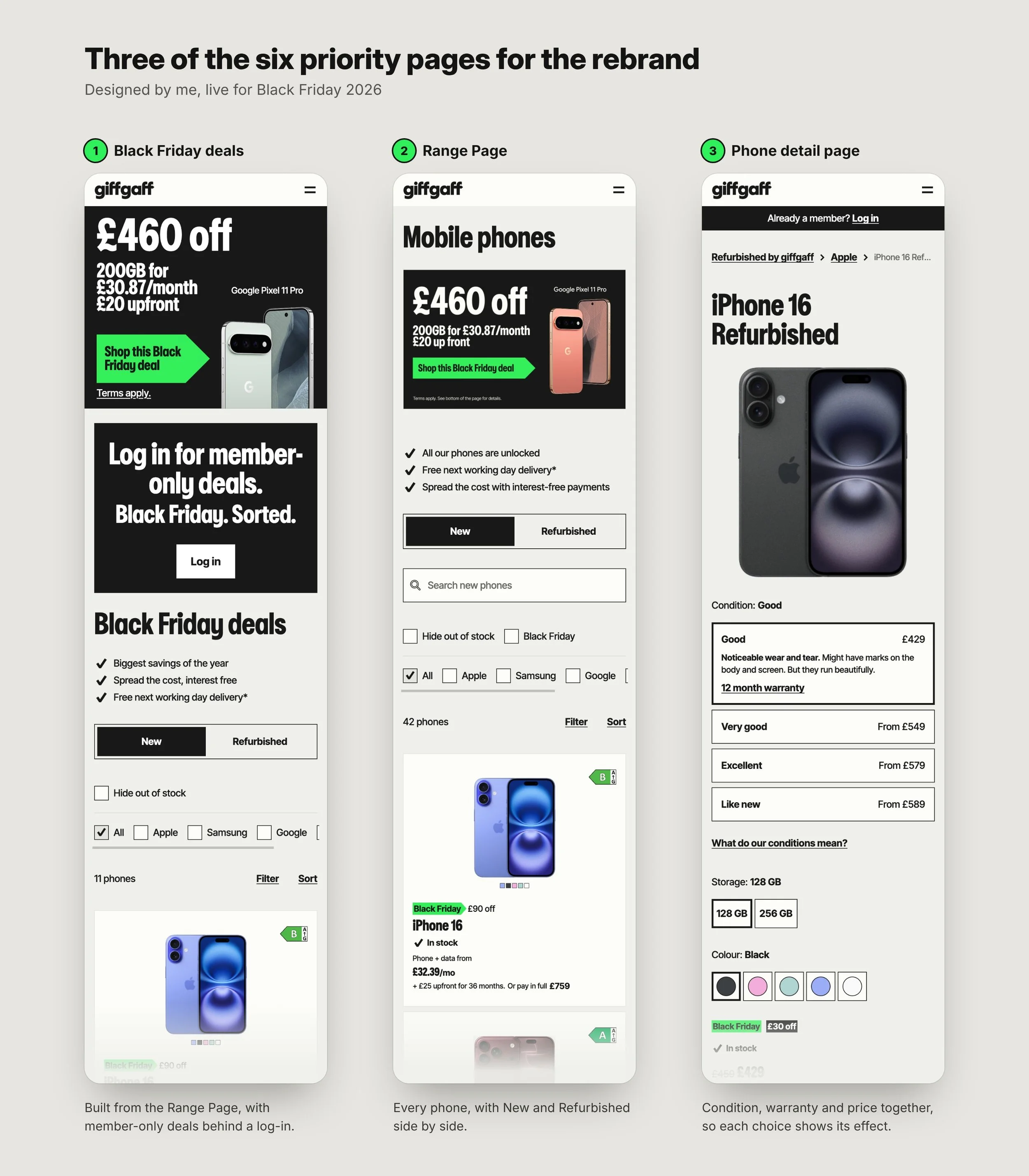
In November 2026 giffgaff launched its rebrand, timed to Black Friday - the business's peak trading moment, centred on handset deals. Six pages were prioritised as critical for the brand launch, and I was given three of them: the Black Friday deals page, the Range Page and the phone detail page.
Those pages were built on giffgaff's new design system, which grew from the semantic tokens I'd championed for over a year before the business prioritised it. Semantic tokens give design and code one machine-readable source of truth - the foundation AI tools need to work from a design system rather than guess at it. I built the token set with AI assistance, by my estimate in about half the time. By launch, the entire design team was building on it, and the journey I designed for the June migration is carrying the new brand into the biggest sales period of the year.
Trusted with the biggest work - and a designer ready to step up
I was pulled off phones twice - first to lead the onboarding redesign that delivered £4.8M in annual EBITDA (its own case study), then to cover Mobile Discovery. Each time I closed out loose ends first, and the team kept shipping, including automated refunds saving £45,000 a year, adapted from Broadband's design.
Part of what made that possible was Jonas, a Product Designer I was asked to mentor. After eight months working across Phones and Payments together, he took on Payments as his own area and I stepped back, and he covered phones for a month during my second absence. He now leads design for Payments and Identity - ten payment screens unified into one, Apple Pay enabled - and has since been hired as a Senior Product Designer.
The outcome
31% fewer clicks on the phone pages, and 28-40% less hesitation before scrolling
Sales held flat through the migration, on the first product live on the new platform - which broadband and roaming then reused almost out of the box
+10% handset sales in H1 2026, year on year - the half-year I was full-time on the journey's design
3 of 6 top-priority rebrand pages, on a design system built from my tokens
3 Claude skills built, one published for every team at giffgaff
Context: giffgaff's revenue grew 5% in 2025, which its published accounts attribute "mainly to higher sales volumes across both new and refurbished handsets".
Where the evidence runs out
The Medallia report found engagement scores fell 16-19% after migration. Three explanations fit the data; I laid out all three and asked BI for the channel and device split that would separate them, rather than picking the comfortable one.
The report also left the biggest question open: had phone orders risen or fallen? The Medallia and Snowflake funnels disagreed in opposite directions, so I refused to quote either and asked BI for a raw count instead. It came back flat: the first full month on the new platform was within 1% of the month before the switch, with a 4% dip in the migration month itself, then recovery. Hold sales steady through the switch - delivered, in BI's numbers, not the funnel's.
What's next
The research is clear that plans and phone specs are competing for the same space on the page. It isn't the first time that's been shown. A 2023 A/B test with more than 100,000 users found that combining plan selection into the phone page cut conversion by 7.4% at 95% confidence. Three years on, the pages were still combined, and my participants were still hitting the same wall.
With the rebrand live and the design system in place, that's what I'd test next: plans and phone specs as separate steps, so they stop competing.
Recognition
A named shout-out from our Mobile Product Director for the accessibility work, and Most Positive Team for the phones team at giffgaff's 2025 awards - where I was also nominated for Rookie of the Year.
"Nigel started the token work our design system runs on today. He shaped the semantic token structure and championed it, with real passion, long before it was on anyone's roadmap. We refined it together, and he was a joy to work with: genuinely receptive to feedback, but always ready to challenge it and argue his point well. By the time I picked it up the structure was in place, along with the first layout foundations, and our November Black Friday campaign was built on that groundwork."
Francesc Perez Picazo – Design System Lead, giffgaff (my line manager)
“What started as a passing comment became, because of Nigel, a full day spent learning from disabled people about how we could make our journeys better for them... That's how he approaches everything: users first, then beautiful designs built with those users in mind."
Abi Harrison-Nye – Software Engineer | Accessibility & Neurodiversity Affinity Group Lead
Worked with Nigel on the same team
"Nigel doesn’t take a brief at face value. He’ll ask why we’re doing something before he asks how, and more often than not that question changes what the team ends up building. He can take a vague ask from the business, work out what’s actually being asked for, and push back on it without anyone feeling pushed. Even once we were each running our own areas he was still the person I’d go to for a second opinion. Any team would be lucky to have him."
Jonas Pereira – Product Designer, Payments and Identity, giffgaff